
Edges that clash with panels ruin a design. I see missed sales when the finish feels off. I will show the 2025 color and texture shifts so you avoid that risk.
In 2025, designers favor earthy tones, soft neutrals, and varied mattes, while textures move from simple grain to deeper, tactile finishes. These trends shape ABS edge banding choices for matching, production, and stock planning.

I will walk you from why color and texture matter to what to stock and how to match. I keep this practical. You will get tools, checklists, and places to test samples.
Why Color and Texture Matter in Modern Furniture Design?
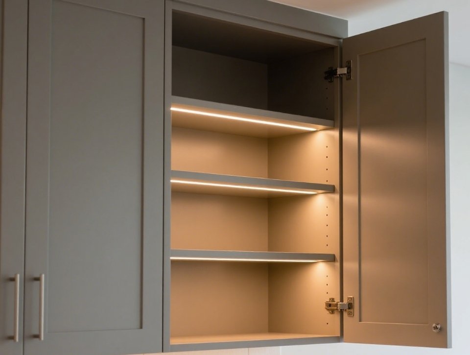
Kitchen islands, cabinets, and office panels fail when finishes clash. That costs time and reputation. I explain why designers and buyers now care more about subtle finishes.
Color and texture set the perceived quality and style of furniture. Proper matching reduces returns and raises perceived value, so edge banding choices now matter as much as board decors.
Dive deeper: visual psychology, functional effects, and buyer impact
I will break this into clear parts so you can act on it.
Visual and psychological role
Designers use color to set mood. I see earthy tones make rooms feel calm. I see soft neutrals make spaces feel modern and clean. These color choices drive edge banding demand. Designers pick edges that either blend or contrast with panels. Edge banding that matches texture looks higher end.
Functional role
Texture affects light and wear. Matte textures hide scratches. Deep woodgrain hides small defects. Gloss shows fingerprints. Manufacturers must pick texture based on end use, like kitchens or wardrobes. I test samples under different lights before I buy.
Business impact
Buyers return mismatched furniture. Returns cost time and money. Good edge banding reduces returns. I advise clients to set clear color and texture specs. They save money and keep customers.
| Factor | Effect on product | What I check |
|---|---|---|
| Color palette | Mood and style fit | Lab measurement |
| Texture | Wear and light behavior | Visual and touch test |
| Gloss | Fingerprint visibility | Gloss meter check |
| Match tolerance | Return risk | ∆E and sample proof |
I recommend you set simple rules. Ask for a sample roll. Inspect it in the real light where the furniture will live. Use a spectrophotometer if you can. These steps cut surprises and protect margins.
Top Color Trends in ABS Edge Banding for 2025?
Designers shifted from high gloss to calm palettes. You must know which colors to offer and why. I list the main shades and what sells now.
In 2025, earthy tones, warm beiges, soft greys, powder blues, and selective deep accents (olive, dark walnut) lead demand. Suppliers sync edge banding collections with major board manufacturers to ensure harmony.
Dive deeper: palette breakdown, sourcing advice, and SKU planning
I will map the palette and give buying rules you can use.
Palette breakdown
I group colors into four buckets. Each bucket serves a market.
- Earthy neutrals. Warm beiges, soft browns, and off-whites. These pair with timber looks and biophilic design. They work for kitchens and living rooms.
- Soft greys and muted tones. Light to mid greys and greiges. These fit modern minimal and commercial spaces.
- Pastel accents. Powder blue and muted pinks appear in statement kitchens and boutique shops. They are niche but growing.
- Deep accents. Olive green, charcoal, and walnut tones give contrast in luxury lines.
Sourcing and SKU rules
I keep a small core stock and add seasonal accents. I buy:
- Core neutrals in large volumes.
- Greys and common woodgrains as medium stock.
- Pastel and deep accents as made-to-order or small batches.
I watch makers like Egger and Kronospan for new decors. They release coordinated decors and edges. I use their swatches to choose matching edge colors. This reduces mismatch risk and speeds sampling.
| Color bucket | Typical use | Stock advice |
|---|---|---|
| Earthy neutrals | Broad market, kitchens | High stock |
| Soft greys | Offices, minimal homes | Medium stock |
| Pastel accents | Feature elements | Low stock |
| Deep accents | High-end, contrast | On-demand |
I advise testing samples under real light. I also advise tracking orders by color for three months. Icons and finishes change demand fast. Use sales data to cut slow SKUs and boost winners.
Emerging Texture Styles: From Ultra-Matte to Deep Woodgrain?
Texture choices now guide perceived value more than ever. I show which textures matter and how they change matching rules.
Trends move toward coarse mattes, tactile woodgrains, and subtle 3D reliefs. Producers add synchronized pores and deeper emboss to mimic real wood and stone. These textures suit the calmer palettes of 2025.
Dive deeper: texture types, measurement, and production notes
I will detail the texture types and give practical checks.
Texture categories
I describe four common textures I buy.
- Ultra-matte fine texture. This gives a soft touch and modern look. It hides light scratches. It works with neutral and grey palettes.
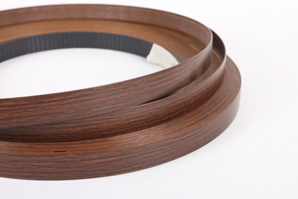
- Open, deep woodgrain. This mimics hand-sawn wood. It shows pore depth and feels tactile. It pairs with feelwood and synchronized pore boards.
- Coarse textured (stone or concrete). This adds rugged character for industrial looks. It suits thicker edges and heavy-use areas.
- Soft satin and light gloss. This remains for certain kitchens and retail installations where a subtle sheen is wanted.
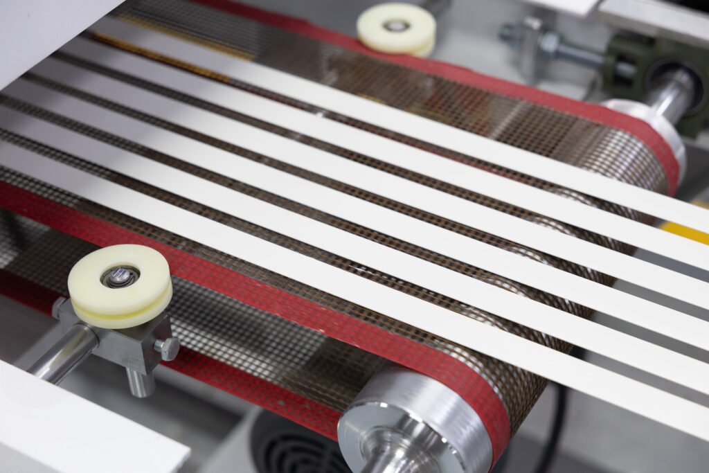
Production and quality notes
Texture depends on emboss roller quality and line control. I check:
- Emboss depth uniformity across a roll.
- Synchronized pore alignment when matching board grain.
- Surface friction — how the edge feels when handled.
- Clean transfer of ink in printed decors.
| Texture type | Perceived effect | Production check |
|---|---|---|
| Ultra-matte | Modern, hides marks | Gloss meter, touch test |
| Deep woodgrain | Natural, premium | Pore sync, emboss depth |
| Stone/concrete | Rugged, tactile | Emboss uniformity |
| Satin/gloss | Lively, reflective | Ink density, lacquering |
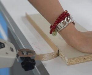
I test by hand. I run the edge through an edgebander and trim it. I look for how the texture reacts to heat and glue. I once rejected a batch because the deep grain crushed during trimming. That cost me time but saved returns. If you order textured edges, demand press proofs and short runs before full production.
How to Match ABS Edge Banding with Modern Board Designs?
Matching is the most common headache I see. I give a step-by-step workflow and tools so you can match reliably.
Match color, gloss, and texture in that order. Use spectrophotometers, gloss meters, and synchronized-pore samples. Supply a sample board, demand a sample edge, and set ∆E and gloss tolerances before production.
Dive deeper: workflow, measurement targets, and acceptance criteria
I will give a workflow you can follow step by step.
Step 1 — Reference and measure
I always start with the actual board sample. I measure Lab values with a spectrophotometer. I measure gloss at 60° or 85° depending on the finish. I note texture visually and by touch.
Step 2 — Supplier proof
I ask suppliers for an extruded or printed sample. I request measured Lab and gloss values for the sample. I check the sample under the same light. I also ask for a synchronized-pore proof if matching woodgrain. This step prevents surprises at scale.
Step 3 — Set acceptance criteria
I use simple numeric targets:
- Color tolerance ∆E ≤ 3 for commercial projects.
- ∆E ≤ 2 for higher-end projects.
- Gloss tolerance within ±5 units at the chosen angle.
- Pore alignment visually approved for synchronized decors.
| Step | Tool | Target |
|---|---|---|
| Measure | Spectrophotometer | ∆E ≤ 3 (standard) |
| Gloss | Gloss meter | ±5 units |
| Texture | Visual/pore sync | Visual match |
| Proofing | Sample roll | On-site test |
Step 4 — On-site test
I install a short run piece. I check glue behavior and trimming. I look for color shift after glue cures. I test edges under store light and natural daylight. I reject batches that shift color or dull the texture after processing. These checks cut rejection risk and protect client trust.
What These 2025 Trends Mean for Furniture Manufacturers?
Trends shape procurement, inventory, and R&D. I list the practical steps manufacturers must take now.
Manufacturers must align edge banding SKUs with board decors, invest in quality finishing, and plan stock for earthy neutrals and synchronized woodgrains. Smaller, faster sample runs will reduce risk and speed time to market.
Dive deeper: inventory rules, R&D focus, and sales impact
I will give clear actions for procurement, production, and product teams.
Inventory and procurement
I buy core neutrals in bulk. I hold medium stock of common woodgrains and greys. I order accent colors and new textures as small batches or on-demand. I track weekly sales for 12 weeks to spot changing demand. I work with suppliers who can run quick small orders. This strategy lowers risk and holding cost.
Production and quality control
I require suppliers to provide measured proofs and production tolerances. I add simple inline checks: thickness, color sample, and a peel test on each batch. I train production teams to report any texture flattening after trimming. These steps reduce rework and warranty claims.
Product and R&D
I suggest R&D test new emboss patterns and matte lacquers with small client pilots. I pilot synchronized pore edges with flagship projects. This creates case studies and shortens sales cycles. Big catalogs alone do not win. Real samples do.
| Area | Action | Benefit |
|---|---|---|
| Procurement | Core + flex stock | Lower cost, less risk |
| QC | Proofs + inline tests | Fewer returns |
| R&D | Small pilots | Faster adoption |
| Sales | Sample-led pitches | Higher conversion |
Manufacturers that move fast on matching and sample proofing win. I focus on proofs, not promises. I test edges the way customers will see them. That keeps deliveries clean and customers happy.
Conclusion
I summarized 2025 color and texture shifts and gave practical steps to match, test, and stock smarter.
Data sources and links
- Houzz — “8 Key Surface Trends for the Year Ahead.” https://www.houzz.com/magazine/8-key-surface-trends-for-the-year-ahead-stsetivw-vs~180280013. (Houzz)
- Decorilla — “Living Room Trends 2025: What’s New in Home Comfort.” https://www.decorilla.com/online-decorating/living-room-trends-2025/. (decorilla.com)
- EGGER — Decorative Collection 24+ (decor and edge coordination). https://www.egger.com/en/furniture-interior-design/decorative-collection/. (egger.com)
- Kronospan — Kronodesign Trend Collection 2025 (decors and synced pores). https://kronospan.com/en_EN/decors/by_collection/kronodesign/trend-designing-reality/. (Kronospan)
- Kronospan / news — Kronospan Trends 2025 announcement. https://decor-melamine.co.uk/news/kronodesign-trend-2025/. (Decor Melamine)