
I once saw a beautiful table fail in a showroom. The finish was wrong and buyers walked away. (PAS)
Texture and gloss shape how people see and touch furniture. They change perceived quality, warmth, and value. I explain how each factor works and what to do.

Good design starts with feel. Keep reading and I will show practical steps you can use with boards, finishes, and edge banding.
Why Texture and Gloss Levels Matter in Furniture Design?
Bad finishes cost orders. I learned that fast. (PAS)
Texture and gloss set expectations. They tell the buyer if a piece is warm, modern, cheap, or premium. You must control both to control perception.
Dive deeper: the perceptual and business reasons texture and gloss belong at the top of your spec sheet
I treat texture and gloss as design tools and quality controls. People judge furniture by sight first. They touch later. Both senses shape buying decisions.
Visually, gloss changes brightness and reflections. High gloss shows sharp reflections and signals precision or luxury. Low gloss hides reflections and signals calm or craft. A gloss meter measures this in gloss units (GU). The common angles are 60° for general use, 20° for high gloss, and 85° for low gloss. Use these angles to set tolerances.
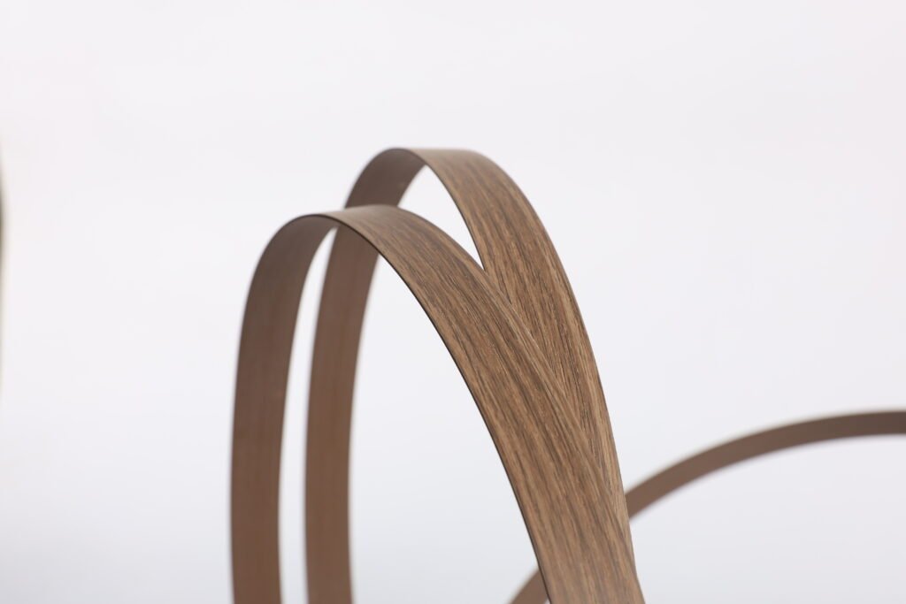
Tactilely, texture gives warmth and grip. Natural, smooth wood often rates higher in emotional touch tests than heavily coated surfaces. People call smooth, natural surfaces “warm” and “authentic.” Rough or embossed textures can feel robust or rustic. I use research on wood touch perception when I recommend finishes.
From a business view, texture and gloss reduce returns when controlled. Uneven gloss or a mismatched texture with edge banding causes visible faults. Those faults create rework and claims. I add texture and gloss targets to my QA sheets. That simple step saves freight and goodwill.
How Texture Shapes the Emotional Feel of Furniture Surfaces?
A customer once chose a cheaper material because its texture felt right. I noticed then that texture often beats price in emotional appeal. (PAS)
Texture changes how people describe furniture. Smooth natural wood feels warm. Pronounced textures feel rustic. Textures guide touch. They also guide lighting and color reading.
Dive deeper: tactile psychology, texture types, and how to choose the right surface
I use three texture categories: smooth, structured, and coarse. Each gives a different vibe.
Smooth textures feel refined. They suit modern and minimalist designs. They reflect light more evenly. Smooth finishes make colors look deeper if gloss is moderate. I advise smooth finishes for living-room furniture where touch feels important.
Structured textures include woodgrain, light embossing, and microtextures. They add visual depth. They hide minor scratches and fingerprints. They also lower perceived gloss. Designers like structured textures for kitchens and wardrobes.
Coarse textures feel rustic and durable. They fit industrial or country styles. They show shadow and strong highlights. Coarse finishes can catch dirt and need different cleaning.
I also watch how texture changes visual gloss. Adding texture often lowers perceived gloss. A surface with micro-roughness scatters light. That scattering reduces sharp reflection but can increase diffuse sheen. Studies show visual gloss tends to decrease as measured roughness increases, though very coarse textures can create contrast that looks glossier in spots. This makes matched edge banding tricky because the same color and gloss can read differently on textured and smooth surfaces.
To choose texture, I ask three questions:
- Where will people touch this piece?
- What emotion should it evoke?
- What maintenance level is acceptable?
Then I pick an edge finish that reads similarly under the same light. I keep samples of board + edge together. That helps clients make confident choices.
The Role of Gloss Levels in Defining Luxury and Style?
I watched two similar cabinets. One had high gloss doors. The other had matte doors. Buyers reacted differently. Gloss changed the story. (PAS)
High gloss suggests precision and polish. Matte suggests craft and calm. Satin or semi-matt sits between and often works best for mixed spaces.

Dive deeper: gloss ranges, measurement, and practical thresholds for design
Gloss is measurable. A glossmeter gives a number in GU at a set angle. Use 60° as the general standard. Use 20° for very high gloss and 85° for very low gloss. These measures let you set clear specs for production.
I group gloss subjectively:
- Matte: 0–20 GU at 60°. Matte feels soft and modern.
- Satin / Semi-matt: 20–40 GU. This feels balanced and hides flaws.
- Semi-gloss: 40–70 GU. This reads brighter and more premium.
- High gloss: 70+ GU at 60° (use 20° measurement for accuracy). High gloss reads luxury or high-tech.
The eye notices small gloss differences at different levels. For low-gloss surfaces, a 3 GU change can be visible. For high-gloss surfaces, you need a finer approach and a different angle. Konica Minolta and gloss instrument makers note that detection thresholds change across the gloss range. That is why I pick angle and tolerance based on the target GU range.
Gloss also affects color perception. Higher gloss can make colors look more saturated because reflections boost contrast. Lower gloss softens color. I advise clients to view samples under the intended room lighting. Approving a sample under store light can lead to surprises on-site. I include gloss units in all approval docs.
Balancing Texture and Gloss for Functional and Aesthetic Harmony?
I had a client who wanted high gloss on a textured board. It looked wrong. I learned to balance both early. (PAS)
You must match texture and gloss to the use case. Kitchens need durable, low-fingerprint finishes. Bedrooms can take softer, matte textures. I show how to align these choices with edge finishes and cleaning needs.
Dive deeper: a practical matrix and rules I follow when specifying finishes
I use a simple matrix to decide texture + gloss for a project. The matrix uses three factors: use intensity, desired style, and maintenance.
| Use intensity | Style goal | Recommended texture | Recommended gloss (60° GU) |
|---|---|---|---|
| High (kitchen) | Durable/modern | Structured / microtexture | 10–30 (matte to satin) |
| Medium (living) | Warm/comfortable | Smooth / light woodgrain | 20–40 (satin) |
| Low (bedroom) | Luxury/calm | Smooth / fine grain | 20–60 (satin to semi-gloss) |
| High-visibility (retail) | High impact/luxury | Smooth + high polish areas | 70+ (high gloss for highlights) |
I test the board and edge together. I measure gloss on both. I also check texture visually and by touch. If the board is textured, I avoid very high gloss edges. A glossy edge on a matt board looks like a sticker.
Practical rules I follow:
- Always assemble a proof. View it under target lighting.
- Record GU and texture name in the spec.
- Ask for lot numbers for large runs. Materials shift batch to batch.
- Pick edge materials that can match texture (matte PET for matte boards, printed PVC for woodgrain).
These checks stop mismatches and speed approval.
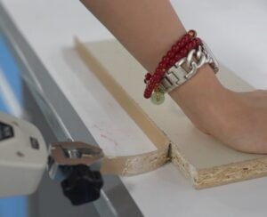
Choosing the Right Edge Banding Finish to Match Board Texture and Gloss?
I lost a job once because the edge reflected too much light. I now always match edge sheen and texture to the board. (PAS)
Edge banding must match both texture and gloss. The right combo hides seams and sells the feel of the whole piece. I give a checklist you can use at quote and at approval.
Dive deeper: edge selection steps, sample workflow, and a ready-to-use checklist
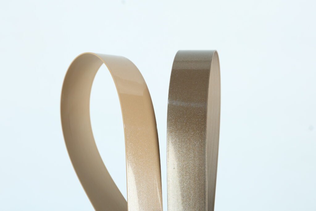
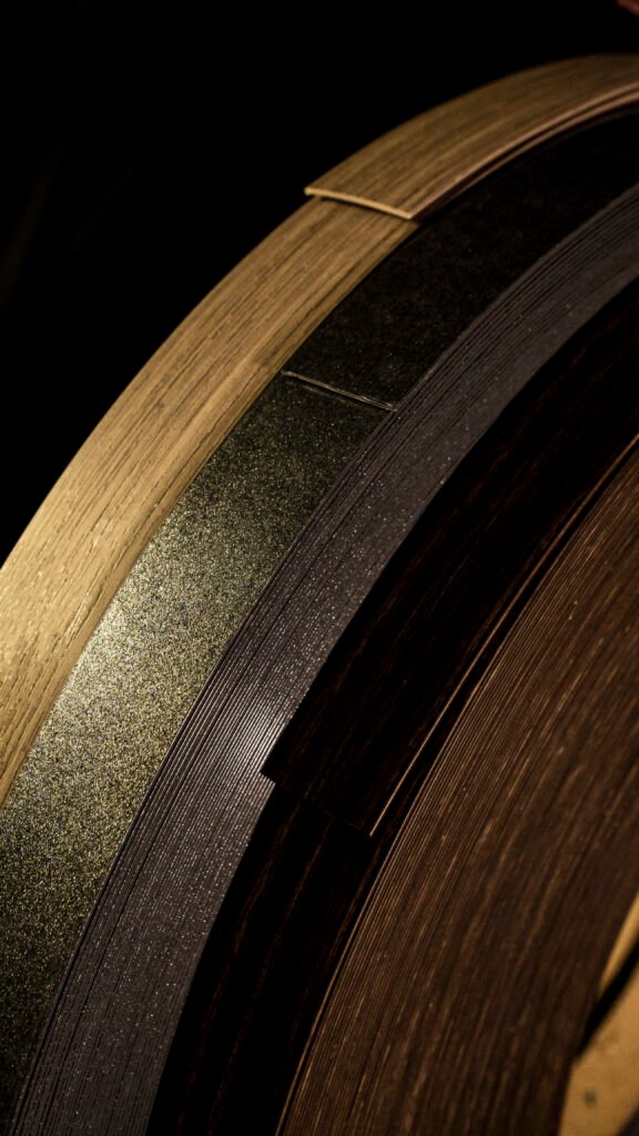
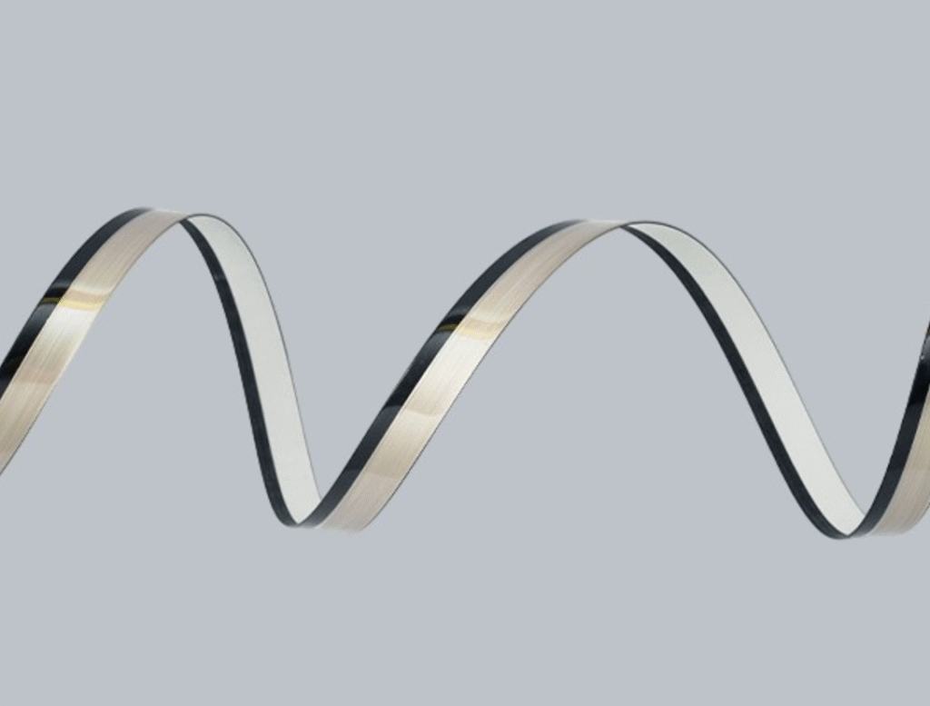
I pick edges by material and finish. Common materials are PVC, ABS, PET, and real veneer. Each reads differently in texture and gloss.
Checklist I use with clients:
- Ask for the board decor code, texture name, and GU target.
- Request a physical board sample with the lot number.
- Produce a pilot edge strip in the proposed material and finish.
- Measure GU on both board and edge. Use same angle and instrument.
- Assemble a proof and view under intended light. Get client sign-off.
- Record Lab/GUI values and store them as the color/finish passport.
Matching tips:
- For matt boards, use matte PET or textured PVC edges. Avoid glossy PVC.
- For structured woodgrain, use printed PVC or thin veneer edges with similar embossing.
- For high-gloss boards, use polished ABS or high-gloss PVC and measure at 20° if GU >70.
I also log samples in a small database. This database links board codes to approved edge SKUs and GU targets. It saves time on repeat orders and prevents surprises.
When you follow this process, approvals go faster. Claims drop. Clients trust you more.
Conclusion
I match texture and gloss with clear specs, measured samples, and assembled proofs. That method makes furniture feel right and sells better.
Data sources and links
- Konica Minolta / Understanding Gloss Standards & Units. (Konica Minolta Sensing)
https://sensing.konicaminolta.us/us/blog/understanding-gloss-standards-units/ - Frontiers in Psychology — Sensory and Emotional Perception of Wooden Surfaces. (Frontiers)
https://www.frontiersin.org/articles/10.3389/fpsyg.2017.00367/full - Rhopoint / Appearance Measurement and Gloss FAQs. (Rhopoint Americas)
https://www.rhopointamericas.com/faqs/appearance-measurement/ - Qualitest — Gloss Measurement with a Gloss Meter (industry note). (Qualitest USA LC)
https://qualitest.us/blogs/insight/gloss-measurement-with-a-gloss-meter - Woodworking Network — Edgeband color matching guidance. (木工网络)
https://www.woodworkingnetwork.com/best-practices-guide/gluing-laminating-veneering/what-know-about-edgeband-color-matching