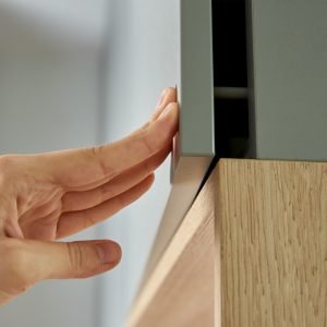
If your furniture edges feel off, it’s probably not the material—it’s the color mismatch that’s ruining everything.
Color-matched edge banding creates a seamless look, while contrasting edge banding makes a bold design statement. The better choice depends on your brand, audience, and furniture style.
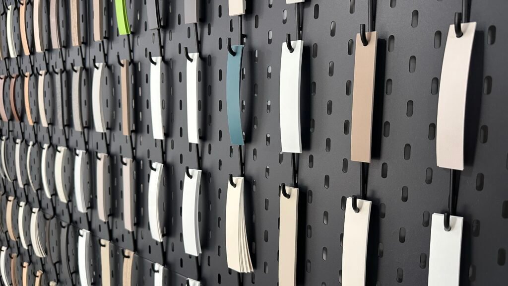
Sometimes, the right edge banding makes your panel look like a designer product. Other times, it just makes it look… odd. If you’re not sure which color path to take, keep reading. I’ll walk you through the options, and you’ll know what works best for your furniture line.
What Is Edge Banding and Why Does Color Matter?
If your panels look unfinished, you’re probably missing the final touch. That’s the edge banding—and its color changes everything.
Edge banding covers raw panel edges and adds both durability and a finished look. Its color impacts whether the piece looks seamless or attention-grabbing.

What edge banding does, in plain terms
Edge banding is the strip that wraps around the side of a panel—usually MDF, particle board, or plywood. It hides the raw edge and makes the piece last longer by sealing it against moisture and impact. But there’s more to it than just protection.
Why color matching matters
When I started selling edge banding, most customers thought it was all about price or thickness. But soon they realized something simple: color mismatch kills the look. If the edge color doesn’t match the panel or contrast with intent, the furniture looks cheap—even if the material is premium.
Types of color strategy
| Strategy | Description | Visual Effect |
|---|---|---|
| Color-matched | Same color as the panel | Seamless, clean |
| Slightly off-shade | Close, but not exact | Cheap, low-effort look |
| High contrast | Totally different color | Bold, design-forward |
Getting the color right is half the design. And it often decides whether a buyer keeps scrolling—or places an order.
The Pros and Cons of Color-Matched Edge Banding
Some people love invisible edges. Others find them boring. But if your goal is premium minimalism, this is your go-to move.
Color-matched edge banding offers a clean and unified look. But it can lack character and make replacement parts harder to manage.
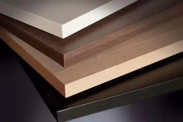
Why people love matching colors
When the edge matches the panel perfectly, it looks like the board came that way from the mill. It’s clean, elegant, and ideal for modern interiors. I often recommend this to clients with Scandinavian or minimalist styles.
The real challenges
Here’s what most people don’t tell you: matching colors is tricky. Different laminate brands use slightly different tones—even for something as basic as “white.” Also, over time, panel colors fade or shift slightly. So if you need to replace a panel, your perfectly matched edge might now be mismatched.
The trade-offs
| Pros | Cons |
|---|---|
| Seamless finish | Difficult to match exact tones |
| Professional appearance | Can look flat or dull |
| Popular in high-end designs | Less forgiving to surface damage |
I’ve had clients who insisted on full-color match. Then three months later, they called me back saying, “It doesn’t look like the sample anymore.” That’s something you need to factor in.
When to Choose Contrasting Edge Banding for Bold Designs
If you want your furniture to stand out, don’t hide the edge—highlight it.
Contrasting edge banding creates a visual frame and adds character to the design. It works best for modern, youthful, or branded styles.
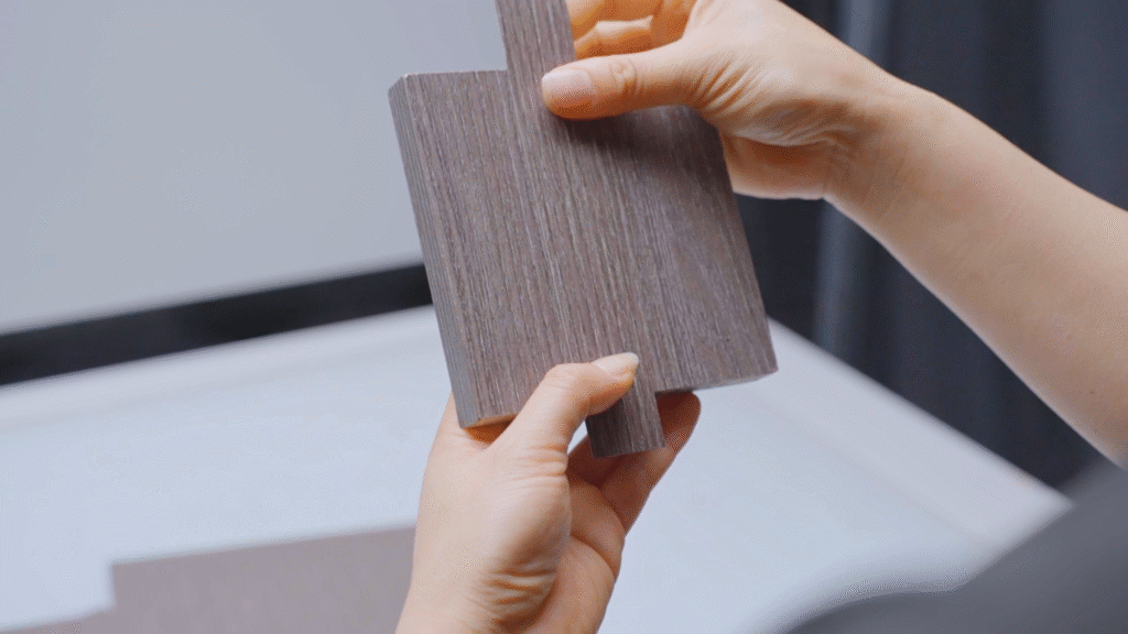
Contrast makes people look twice
A black edge on a white panel. A neon strip on a plywood desk. These combinations make the furniture pop. I’ve seen fast-growing furniture brands use this method to make their products stand out in crowded showrooms and online catalogs.
Where it works best
You should use contrast if your brand focuses on expressive design. For example, kids’ furniture, urban workspaces, or retail displays often benefit from bold color edges. But use it carefully. Overdoing it turns a modern look into a mess.
Know your customer
| Use Case | Recommended Contrast Use |
|---|---|
| Minimalist interiors | Avoid contrast |
| Commercial furniture | Use light contrast (e.g., gray/black) |
| Kids or youth brands | Bold contrast adds personality |
| Custom cabinetry | Depends on client taste |
I always ask customers: Who are you designing for? Because what works for a tech startup office might not work for a luxury kitchen.
How to Decide: Matching vs Contrasting Based on Furniture Style
Design isn’t just about what you like—it’s about what fits the product and the people who use it.
The best edge banding strategy depends on your furniture’s use, style, and target customer. Neither match nor contrast is always better—it’s about the right context.
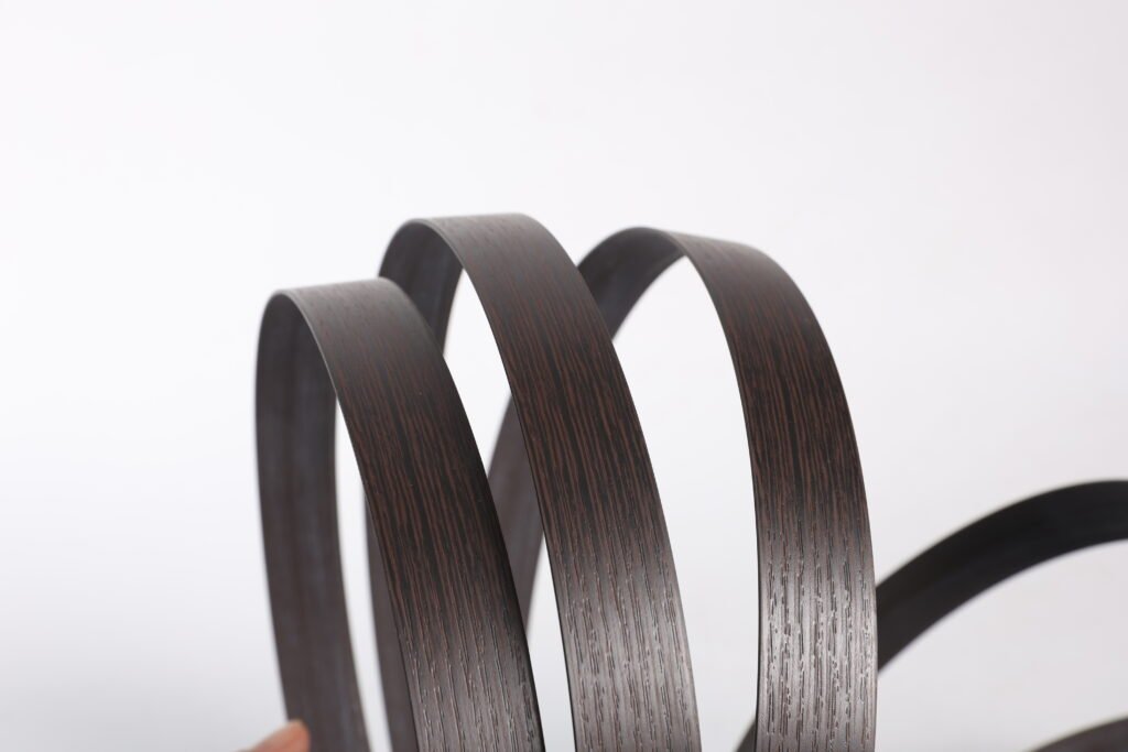
Step 1: Look at the product style
Start with the big picture. Is your furniture meant to blend in or stand out? For example:
- Minimalist cabinets → go with color match.
- Student desks → consider contrast for energy.
- Office workstations → maybe a soft contrast.
Step 2: Know your audience
If your clients are architects or interior designers, they probably want match. If you’re selling to cafes or retail chains, contrast may help your design stand out.
Step 3: Think about lifecycle
Matching edges are harder to replace or patch. Contrasting edges are more forgiving. So if your product is going into a heavy-use area, contrast could be the more practical choice.
Decision guide
| Criteria | Go with Match | Go with Contrast |
|---|---|---|
| Clean, unified look | ✅ | |
| Youthful, bold style | ✅ | |
| Easy replacement | ✅ | |
| Designer-grade finish | ✅ |
I’ve worked with furniture factories that started with full match styles, then slowly added contrast options as they diversified. It’s never one-size-fits-all.
Top Design Tips for Perfect Edge Banding Color Combinations
No matter which route you choose, getting the colors right is still key. A poor color combo ruins both styles.
Use real samples, test in lighting conditions, and stick to a defined color palette. These steps ensure your edge banding looks intentional, not accidental.
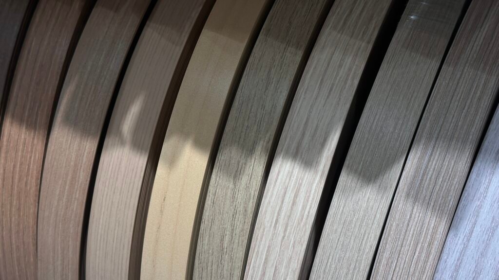
Use a color chart
Most laminate brands like Egger or Kronospan have matching edge banding charts. Start there. Don’t guess based on online photos. Order samples.
Match lighting conditions
What looks “almost perfect” in the warehouse might look off in a client’s showroom. Always test your panels and edge banding in natural light.
Stick to your palette
If you’re a furniture brand, define 5–7 core board colors and stick to them. That way, you can pre-stock edge banding rolls that match or contrast those finishes. This saves time and keeps your visual identity consistent.
Sample testing process
| Step | Action |
|---|---|
| Get panel and edge samples | Physical samples only |
| View in daylight | Avoid yellow indoor light |
| Test under showroom lights | Match to final install location |
| Take pictures | Review side-by-side on phone or screen |
Clients I work with who skip this process often call back with, “It didn’t look this way in the catalog.” A 15-minute test saves a whole return shipment.
Conclusion
Choosing between color-matched and contrasting edge banding isn’t about right or wrong—it’s about what works for your furniture, your customer, and your brand.


